The Dating Game:

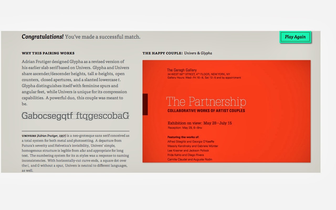
The two typefaces that made a happy couple for me were
Univers and Glypha. I played
around with different typefaces, but Univers was my favorite. The sans serif letter “K” stood out to
me (my name also starts with a “K”). Next in the process I chose to “embrace the
past.” This outcome was not
favorable. So I kept playing
around and chose to “seek the similar.”
This when I made a good match.
This pair included one sans serif and one serif typeface. Before even reading what the website
had to say about why the pair works, I looked at the two together on the
poster. I really enjoyed looking
at the contrasting typefaces. I
never noticed how much of a difference sans serif and serif made, but it was
really noticeable here. I looked
very good with the variance between the two typefaces. What was also interesting to me in the
poster was the title of the poster was in Glypha (slab serif). Usually posters and titles are sans
serif. After looking at the
poster, I read into what the website said about the two typefaces. According to the website, the designer
created Glypha as a new version of his earlier Univers with slab serif
added. Univers and Glypha have the
same ascender and descender heights.
As displayed in the poster, Univers has unique compression
capabilities. Glypha stands out
because of its feminine spurs and angular feet. Andrian Frutiger designed both of these typefaces (Univers
in 1957 and Glypha in 1980).
Univers is different from Futura and Helvetica. It is a very simple typeface that is
legible from afar and works for long text. Glypha’s named comes from the word “hieroglyph” and is meant
to remind people of Egypt. The
square serifs and variant stroke widths appear “forcibly engineered,” but the
typefaces numerous weights are a “testament to its utility.”
Type Anatomy:
I chose Raavi as my sans serif typeface. This was a very simple and modern typeface in my eyes. The way the shoulder in the capital "R" extended the same distance as the tail did was visual appealing to me. This is a very simple typeface that can be condensed if need be. If this typeface was a movie, it would be a 007: James Bond film. It is very clean cut and modern much like James Bond. I could imagine this typeface on a memo on a Bond film.
The serif typeface I chose was Californian FB. This typeface is very elegant with beautiful details. The tail in "Q" stood out to me. The "X" also has a curve in one of the cross bars. It has subtle details that add a little flair to it. For example, the apex in the "A" ascends beyond where most apexes would end. If this typeface was a car it would be a Rolls Royce. Very elegant and simple yet beautifully designed. The subtle details that add a little flair are reminiscent of the wood grain, high tech features, chrome accents on a Rolls Royce.


No comments:
Post a Comment