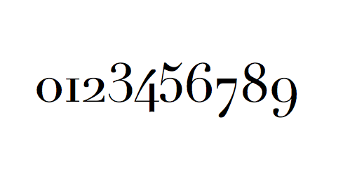
Didot is a name given to a
group of typefaces named after the famous
French type producing family. The classification is known as modern. I really
like this typeface because it communicates sophistication and simplicity. The
first time I saw this typeface, I immediately thought of high-end brands such
as Tiffany & Co and Dior. They both use typefaces similar to didot in that
they have serifs and rounded tails. Didot was actually used by the famous
broadcast networks CBS and The Style Network for many years. Didot is a serif
typeface that uses very thin strokes for the serifs. When using caps, Didot also
has very thin hairlines, (i.e U) which makes the type look elegant and girly,
in my opinion. Lastly, one of my
favorite aspects of Didot is the unique look it gives numbers. They all have
very artistic strokes and are off balanced when it comes to baseline and
capline. They have very rounded edges, making the typeface seem approachable
(if used for a brand) and a mixture of thin and thick strokes (i.e 4) It
represents music created by Micheal Buble while he was driving a Mercedes Benz.
The san serif typeface I
chose was very easy because it has always been my favorite. Papyrus, looks
handwritten, is widely available and was designed by famous graphic designer,
Chris Costello in 1982. I also love that it has an old fashioned, almost sand
script look to it, as if it was written with an ink quill on parchment. In
fact, It took over 6 months create by means of calligraphy pen and textured
paper. Costello’s inspiration came from his idea of what English text
would look like 2000 years ago. Papyrus has such a unique look to it because of
its italic looking dots and the very curly ‘y’. It is used fro the iced tea
brand, Arizona, and for the television title “The Crocodile Hunter”. Papyrus
has a very exotic but comforting feeling that makes me feel beautiful and
timeless. It represents classical music and a horse and buggy.


No comments:
Post a Comment